Have you noticed cheap gyms like Planet Fitness and GoodLife keep opening new locations across Toronto? High-end gyms are doing well too, with sophisticated fitness clubs becoming a luxury trend.
View this post on Instagram
⬆ That’s a gym waiting room!
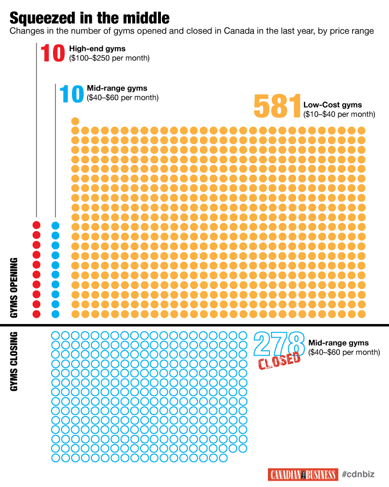
In this competitive climate, mid-range gyms are struggling to stay open. This chart shows that in 2015, 581 low-cost gyms opened and 278 mid-range gyms closed across Canada.
The YMCA’s Problem:
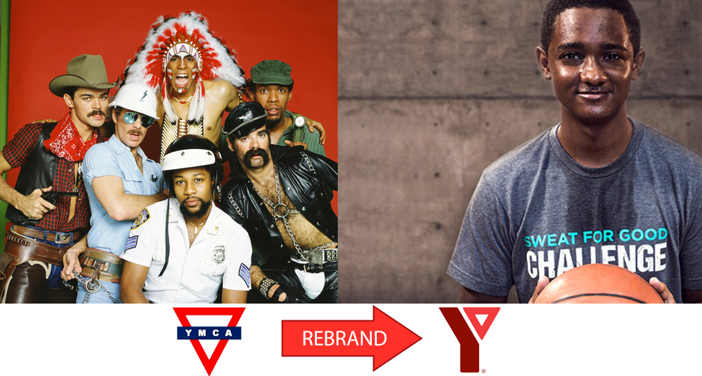
To put it bluntly, the YMCA isn’t the cheapest, nor the fanciest gym. It doesn’t have a niche like a boxing gym or a crossfit studio and it lacks a cool factor (most people associate it with a dance from the 70s)

The Toronto YMCA was facing declining membership, especially with young people who “saw us as the place they took swimming lessons as a kid.” So they went to Ontario marketing agency Outpost 379 for a brand overhaul.
?Brand Makeover ?
Sweat For Good is at the centre of the rebrand. It’s a series of videos, print ads and merchandise that emphasise what makes the YMCA (now simply known as the Y) different from other gyms.

How Sweat for Good rebrands the Y
The Sweat for Good campaign is meant to connect working out with doing social good. “The sweat you break at the Y isn’t just for you; it’s for all of us.” The YMCA provides essential immigration services, youth housing services and camps, childcare and employment services. You don’t see other gyms doing all that!

Diversity and Body Positivity
The YMCA also shows that sweat is universal. It is the same for any gender, race, ethnicity, religion, income level, size or shape. This inclusive vibe is different from other gyms who talk about sculpting the perfect body – instead the YMCA shows real staff and members with all kinds of bodies.

Welcoming but Cool
The heart of the campaign is a warm and friendly energy but the Y didn’t fall into the trap of being too colourful and dorky looking (think comic sans font.) The black and white ads have high contrast photos of badass looking people. This applies to the Toronto Y’s custom printed t-shirts, branded water bottles and gym bags too. The YMCA chose black and grey shirts with minimal white text. Where other fundraiser shirts would end up in the discount bin, these screen printed t-shirts are worn and kept.
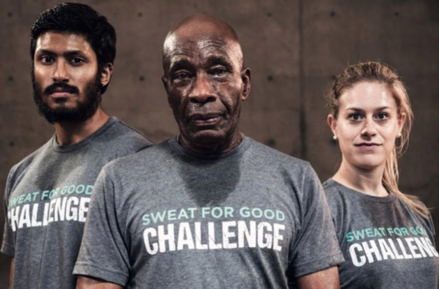
The campaign goes beyond selling custom t-shirts and branded water bottles for a fundraiser, it represents the start of a new chapter for the YMCA.
I have to admit, this campaign has worked on me. I joined the Y because it is a positive community centre with people of all ages. It’s a place where I feel super comfortable being myself and working out at my own pace.
What can we learn from the YMCA’s branding?
Consider what is special about your brand and lean into it. The Y could have tried to copy another gym’s branding but they focused on their own unique appeal.
Other Toronto gym brands the Y could have copied (but didn’t)
Comparing the YMCA’s shirt designs with other gyms makes their choices clear. Every gym in Toronto is fighting for membership, here are five other fitness studios with very different design aesthetics.
1. F45 goes for the Athletic Lifestyle niche
I live across from an F45 gym and I see truly dedicated people go in there every morning at 6am and work their asses off.
The concept is simple: our studios all over the world offer a 45 minute High-Intensity, Circuit Training workout class for our studio members. We have developed 27 different 45 minute workouts, with more currently in development. Our studios offer the same class at different times throughout the day. Every day throughout the week offers a different 45 minute workout. The workouts are created by the F45 Athletics and Peak Performance Department from a database of over 3,000 different exercises, so our members never get the same workout twice.
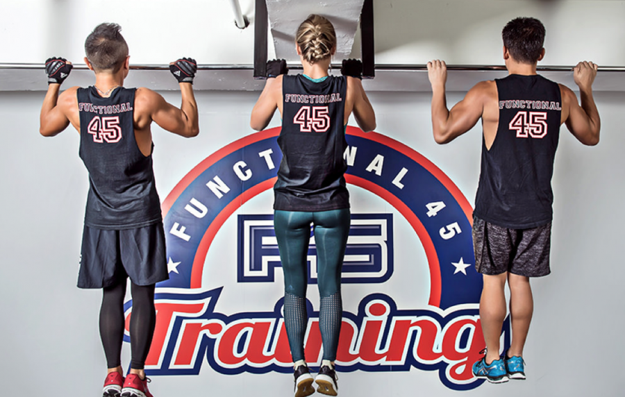
The YMCA could have imitated the sporty apparel of F45, but this sporty look better fits with their lifestyle branding. The branded tank tops and printed t-shirts match that high energy brand.
2. GoodLife Fitness goes for a Bold Canadian brand

Reading those facts, I realize that GoodLife Fitness is a MASSIVE brand with a ton of recognition. It makes sense that they went for a bold, instantly recognizable design aesthetic.
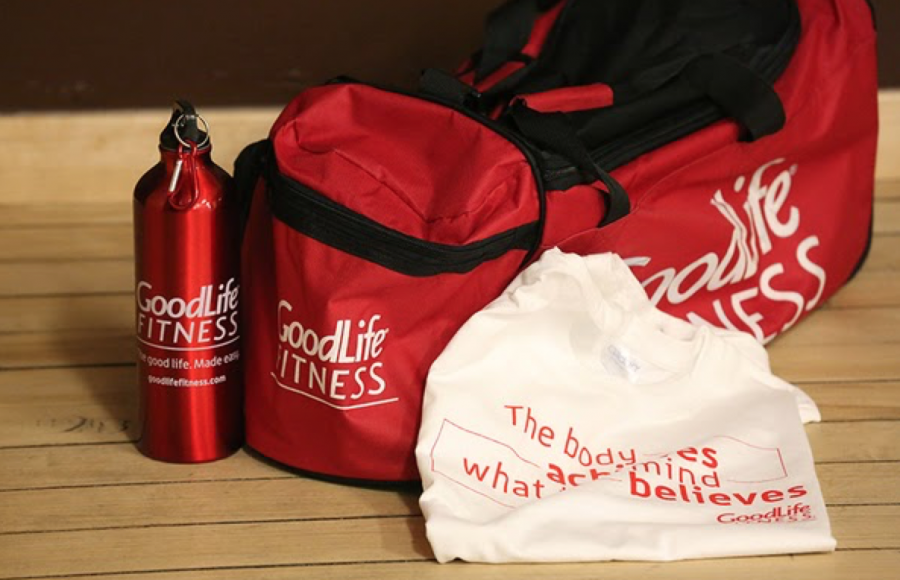
These branded t-shirts, gym bags and printed metal water bottles say “We are Canada’s largest gym and we know it!”
Despite the size of the company, GoodLife works to keep an intimate, friendly environment at their gyms. I feel like this friendly Canadian energy is present in the merch design as well.
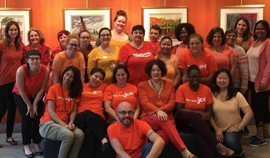
3. The JCC embraces Colour and Community
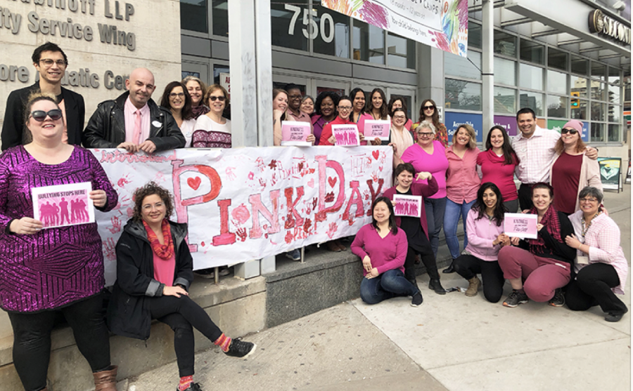
The JCC in Toronto has a bright and colourful branding. It’s fun loving and diverse, much like the gym itself which has become way more than a Jewish Community Centre in the city. These printed t-shirts and tanks have a sense of community with a focus on special events.

4. Utkata Yoga has a Modern Look
The sleek branded tees of our friends at Utkata Yoga tells you they are a newer, more agile gym alternative.

Honestly I respect the way the Y has gone about rebranding. The campaign has worked on me. I can’t seem to cancel my YMCA membership when I know they are doing such good work!
Read More
How do record stores get massive crowds in 2019?
Our favourite booths at the Toronto One of a Kind Show
Utkata Yoga branded themselves as more than a gym
Promoting your brand with custom water bottles
