Pantone announced the ‘Pantone Color of the Year 2022’ They call it… drumroll…
PANTONE 17-3938 Very Peri
In this short article, I will discuss:
- Why should you care
(Hint: if you are a creator or a company, this may be relevant to you.) - How is the Pantone colour of the year selected
- How the pandemic influenced this colour choice
Note:
I spell Color the American way when I quote Pantone. I spell it the Canadian way: Colour, all other times.
Why should you care?
When I heard about ‘Pantone’s Color of the Year’ selection, my first thought was, what do I care what some “experts” at Pantone chose?
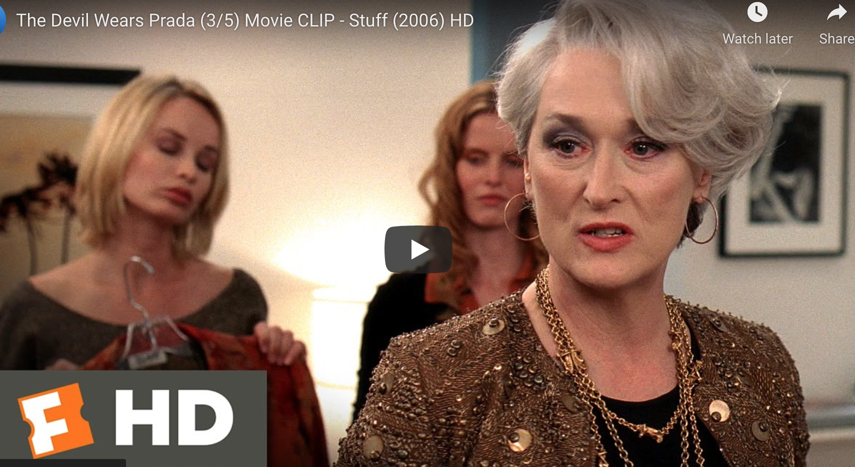
But if you are a creator or get custom printed items for your group or company, this is relevant to you. Trendsetting things like the ‘Pantone Colour of the Year’ or designer fashion shows in Paris trickle down into our lives and make a difference. This movie clip from the ‘Devil Wears Prada’ came to my mind as it perfectly delivers this message.
Keep in mind this ‘Very Peri’ colour when you order printed T-shirts or any customized promo product or if you create any designs or even a new logo for a company.
How is the ‘Pantone Colour of the Year selected?
A team at Pantone spends the year observing what colours are emerging in trendsetting cities like Paris, New York, Milan, Tokyo and other cities. What colours are showing up in street fashion, cosmetics, shoes? They look for cues from the art world and the leading artist’s use of colour palettes. What is emerging in paintings, street art, graphic design? With all of us spending so much time online, they also look for trends in the digital world, gaming, and virtual reality.
Then there is the intangible, what is in the zeitgeist, which means what is in the air, the general thought, the feelings and tastes for this particular feeling.
Pantone puts it like this:
“We are living in transformative times. PANTONE 17-3938 Very Peri is a symbol of the global zeitgeist of the moment and the transition we are going through. As we emerge from an intense period of isolation, our notions and standards are changing, and our physical and digital lives have merged in new ways. Digital design helps us to stretch the limits of reality, opening the door to a dynamic virtual world where we can explore and create new color possibilities. With trends in gaming, the expanding popularity of the metaverse and rising artistic community in the digital space PANTONE 17-3938 Very Peri illustrates the fusion of modern life and how color trends in the digital world are being manifested in the physical world and vice versa.”
How the pandemic influenced this colour choice
I believe that this year more than in the past, the Pantone team focused on the zeitgeist. With COVID making travel harder, they tuned to the mood and general feeling. The past two years have been difficult for all of us. We went through a pandemic that restricted us and locked us up. We have an urge to transform and emerge from our cocoon and become butterflies and spread our wings anew.
Pantone’s Very Peri ‘Color of the Year’ represents this:
“PANTONE 17-3938 Very Peri is a symbol of the global zeitgeist of the moment and the transition we are going through.”
What changes are you going through?
Wishing you a healthy and happy 2022 – from all of us here at Artik in Toronto Canada.

