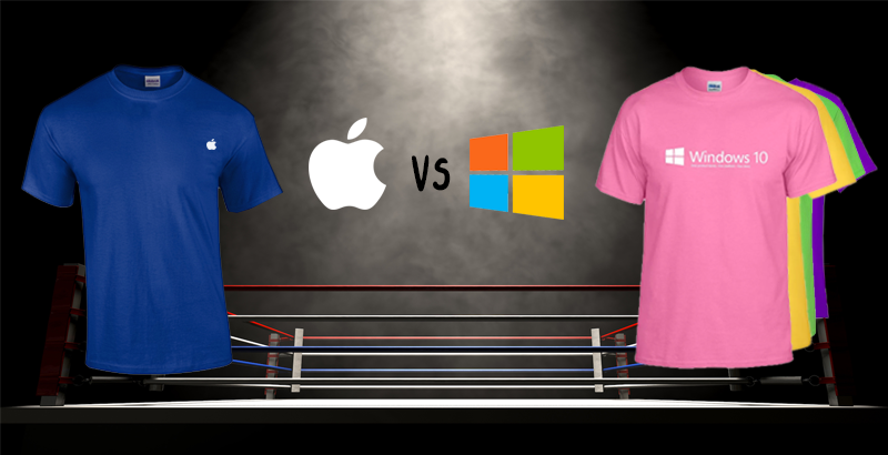
Let’s bring our competitors into the ring,
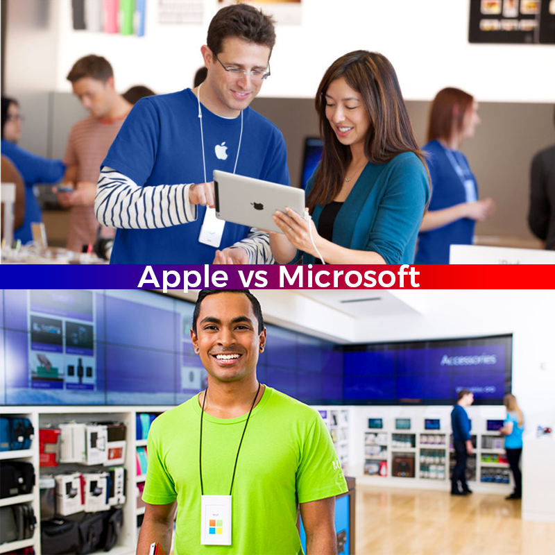
In the red corner is Microsoft. Weighing in at 135,000 employees and with a value of $753 billion dollars. In the blue corner is Apple with 132,000 employees and a value of a trillion bucks (give or take a billion).
Let’s fight!
When your crammed into a crowded Apple Store on Black Friday surrounded by dabbing neonates and confused elders, it’s nice to see the blue t-shirt of a Genius and feel like everything is going to be ok. Apple’s uniforms are calming to look at.
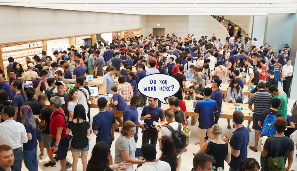
Problem is blue t-shirts are so common that you aren’t able to tell who is an employee and who is just wearing blue. You’ll find yourself staring at chests, trying to find that tiny printed Apple logo.
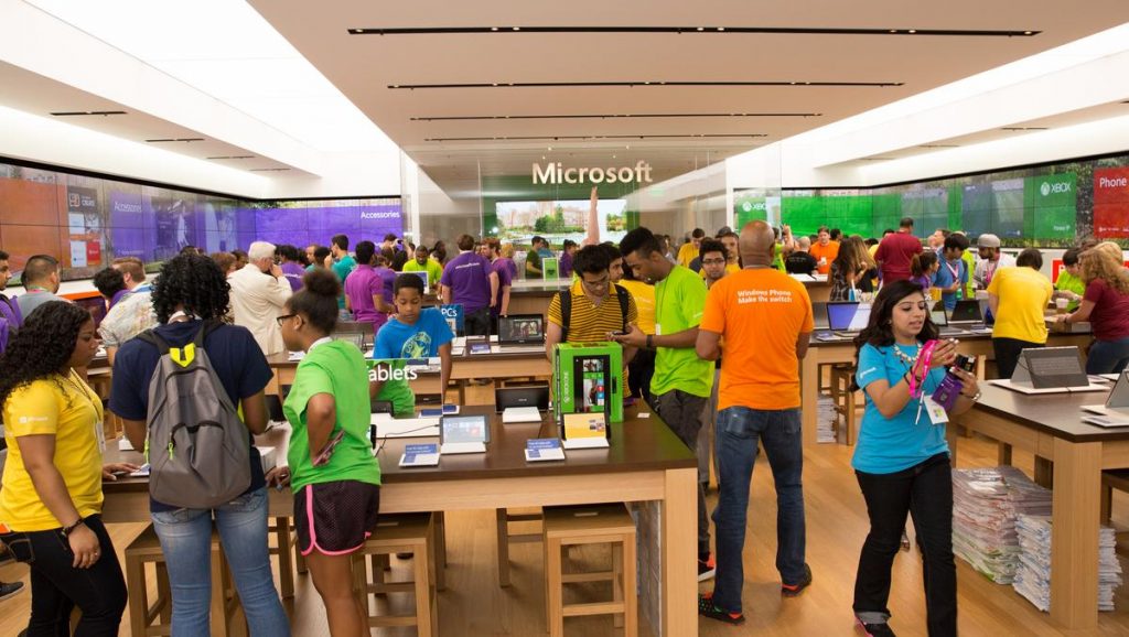
Holy cow!
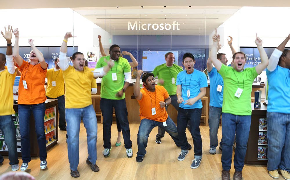
Microsoft went for it with the brightly coloured uniforms. These shirts are unique enough that you won’t mistake a random person for a Microsoft employee.
The lime green, dandelion yellow, hot purple and sky blue are not the most relaxing hues to look at, but they’re fun and inviting.
Why did Microsoft make their uniforms so bright?
Imagine you work at Microsoft. One day your boss comes up to you and says:
- Can you design uniforms for the Microsoft Store employees?
- Make sure you don’t rip off the Apple uniforms.
- Also, make sure the uniforms match our branding (which is currently changing)
- They need to be distinct enough to stand out in the mall.
- Don’t do anything too weird. Or too normal.
- Good luck!
You can see the challenge they faced, I think Microsoft’s solution was creative and surprisingly modern. Taking colours from the Windows logo makes the store look lively and fun.
It speaks to a growing divide between the two companies.
Back in 2007, Apple defined coolness as a black turtleneck and a sleek phone. Everything was simplified and reduced to simple shapes and white/gradient backgrounds.
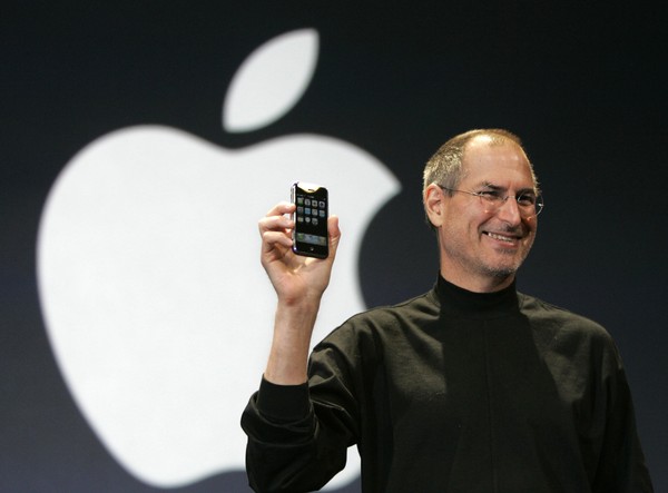
Suddenly every company wanted to modernize with a simplified logo.
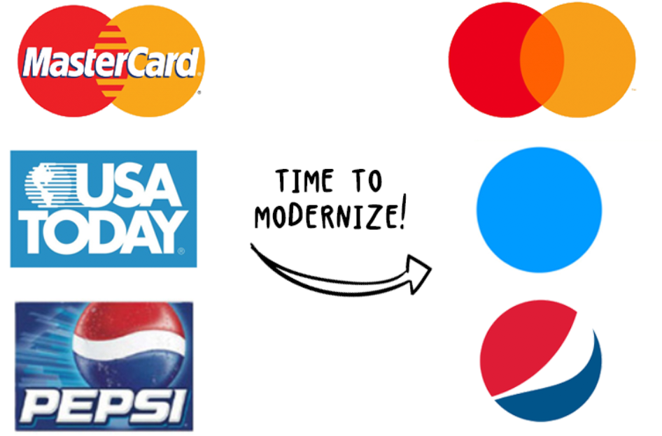
Companies that had a unique identities were hacking them down to simple shapes.

Now it’s 2019 and you can feel the pendulum swing away from simplicity. We want humanity. We want complexity, we want honesty. Life is more interesting than a clean brand.
That is why I like the direction Microsoft has gone with their uniforms, their stores and their branding. Everything is fun and lively and colourful. Check out these articles saying the Microsoft store is more fun and Microsoft has stolen Apple’s “cool factor.”
Microsoft isn’t trying to look cool, and isn’t that the coolest thing you can do?
Conclusions
Apple and Microsoft have gone in different directions over the years. Apple stuck with sleek and simple design while Microsoft is going for a dorkier, more vibrant look.
You’ll have to decide which brand you like better, but for me… Microsoft wins.


At Artik we put way too much thought into stuff like this
If you follow us on Instagram, you know that we’re design nerds.
About 35 years ago, we opened Artik in a flea market in Toronto. We started by printing our own funny designs to sell to tourists, over time we started printing other people’s designs on t-shirts and hoodies.
Yada yada yada, now we’re Canada’s greatest screen printing and embroidery shop.
We work with all kinds of people working on all kinds of different things. There are constantly new people coming in and everyone has their own ideas for merch, promo items and apparel.
So if you want to order your own custom tees for staff uniforms we’re your best bet. We also screen-print designs onto hoodies, customize mugs and bottles, embroider hats and make uniforms for sports teams.
Check out our full site www.artik.com to see everything we do, maybe one day we’ll work on something together.
Until then, bye bye!
[Editors note: You don’t need to say “bye bye” at the end of blog posts.]
