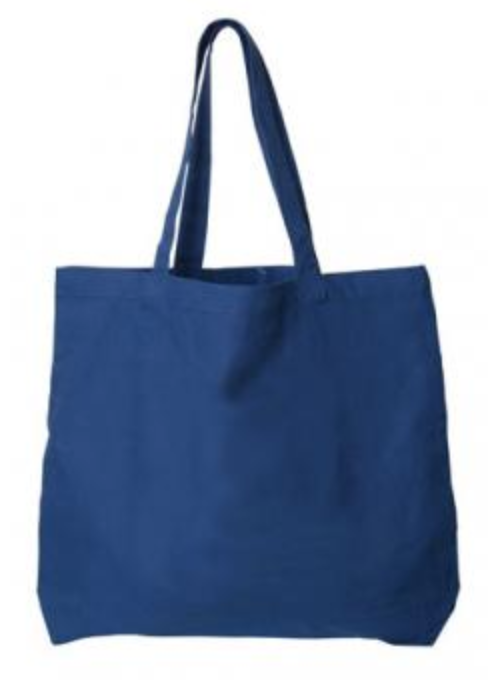
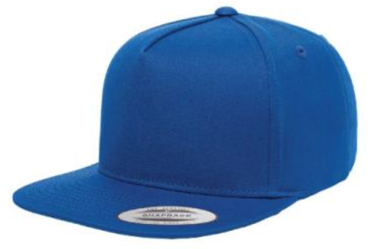
You know those little colours booklets you see at the paint store? At Artik we use them all the time to make sure our inks are perfectly mixed for printing custom designs on t-shirts and other apparel.
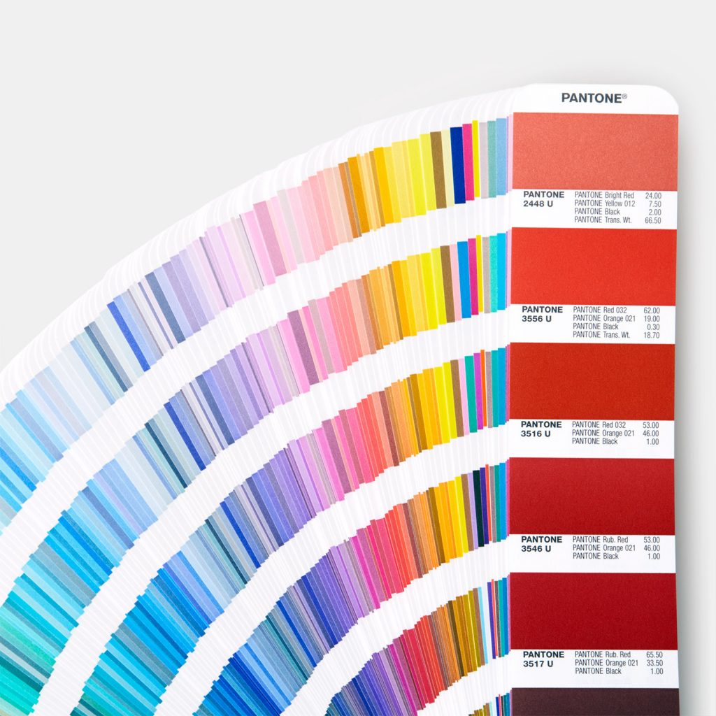
This little colour book costs about $200 to replace annually! We replace them because the colours fade over time and accuracy is essential. Every year, Pantone crowns a Colour of the Year. You can see some of their choices over the last 20 years:


This year, the experts at Pantone chose Classic Blue as the Colour of the Year.
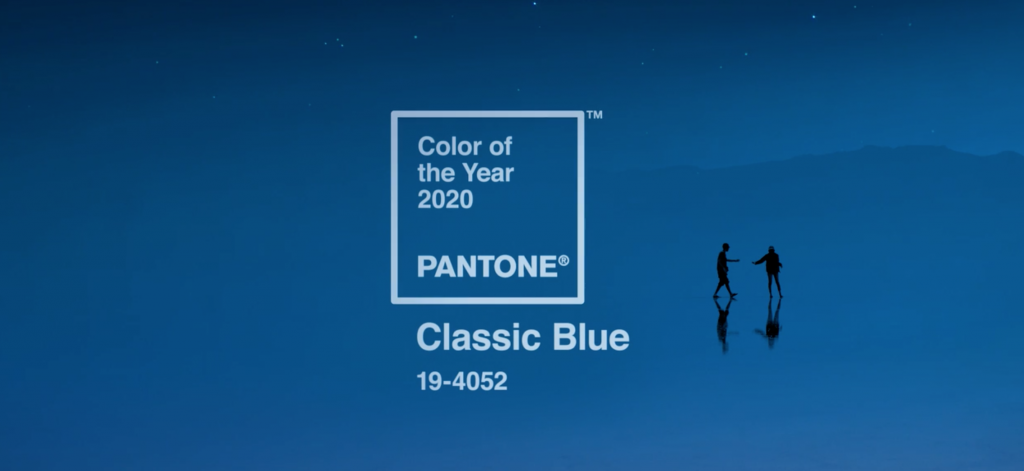
“Instilling calm, confidence, and connection, this enduring blue hue highlights our desire for a dependable and stable foundation on which to build as we cross the threshold into a new era.”
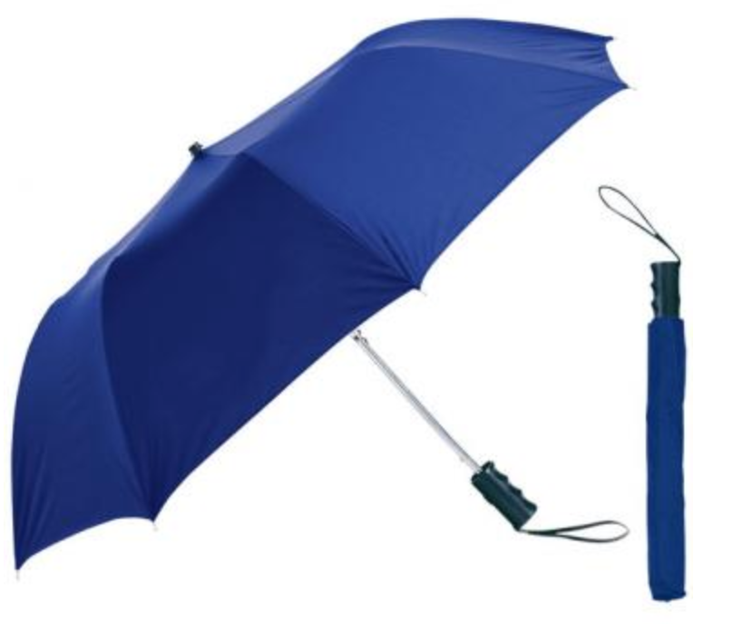
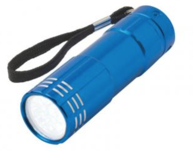
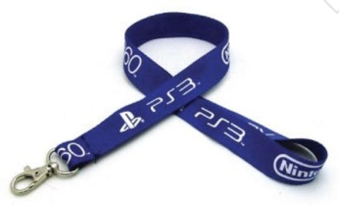
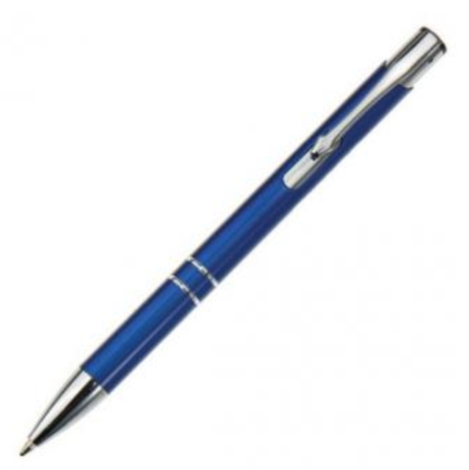
We agree! That’s why we chose a very similar colour for our logo when we rebranded in 2017.
As Pantone says, this colour is comforting and dependable. That’s why we chose it to reflect our business – we have been around since 1985 and we offer a complete satisfaction guarantee.
Perhaps in these days of fake news and scammy websites, a trustworthy colour instils confidence..
Pantone gets a little poetic in their description of this colour:
A timeless and enduring blue hue, PANTONE 19-4052 Classic Blue is elegant in its simplicity. Suggestive of the sky at dusk and imprinted in our psyches as a restful color, Classic Blue brings a sense of peace and tranquility to the human spirit, offering refuge. Aiding concentration and bringing laser like clarity, PANTONE 19-4052 Classic Blue re-centers our thoughts. A reflective blue tone, Classic Blue fosters resilience.
As technology continues to race ahead of the human ability to process it all, it is easy to understand why we gravitate to colors that are honest and offer the promise of protection. Non-aggressive and easily relatable, the trusted PANTONE 19-4052 Classic Blue lends itself to relaxed interaction. Associated with the return of another day, this universal favorite is comfortably embraced.”

